
Capital One Offers Center
Role: Primary UX/UI Designer, Native Designer (Android, iOS)
Length: Feb 2020 - Aug 2020
Tools: Figma
📔 Project Overview
As Capital One continues to forge a name for itself in the premium credit card market, it needs to adopt features and benefits that competitors and industry leaders currently have. One of these differentiators is special offers for cardholders. I was the primary UX/UI designer for our Offers Center in order to create a seamless experience for users who want to take advantage of offers and upgrades.
✏️ Responsibilities
Wireframing, designing, and iterating web and native designs
Championing the best customer experience to our tech and product partners while ensuring designs matched business goals and tech constraints
Crafting interactive prototypes for usability testing and synthesizing research findings


Problem Space
⚡️The Challenge: How do we help users find, evaluate, and redeem offers?
While Capital One had specialized and promotional bank offers, there was no centralized hub for these offers to live. Users would see Capital One offers for new cards or upgrades on their account home that would arbitrarily disappear the next time they logged in. We needed to create an experience that allowed users to:
Easily find offers from their account (promoted entry point)
Access all their eligible offers in one centralized location
Compare, view, and redeem offers
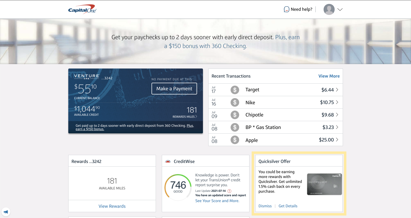
Promoted offers would appear on the landing page when you log in to your Capital One account.

However, if you didn’t click directly on that offer, there was no way to find it afterwards - the only item underneath Offers were Balance Transfers.
RESEARCH
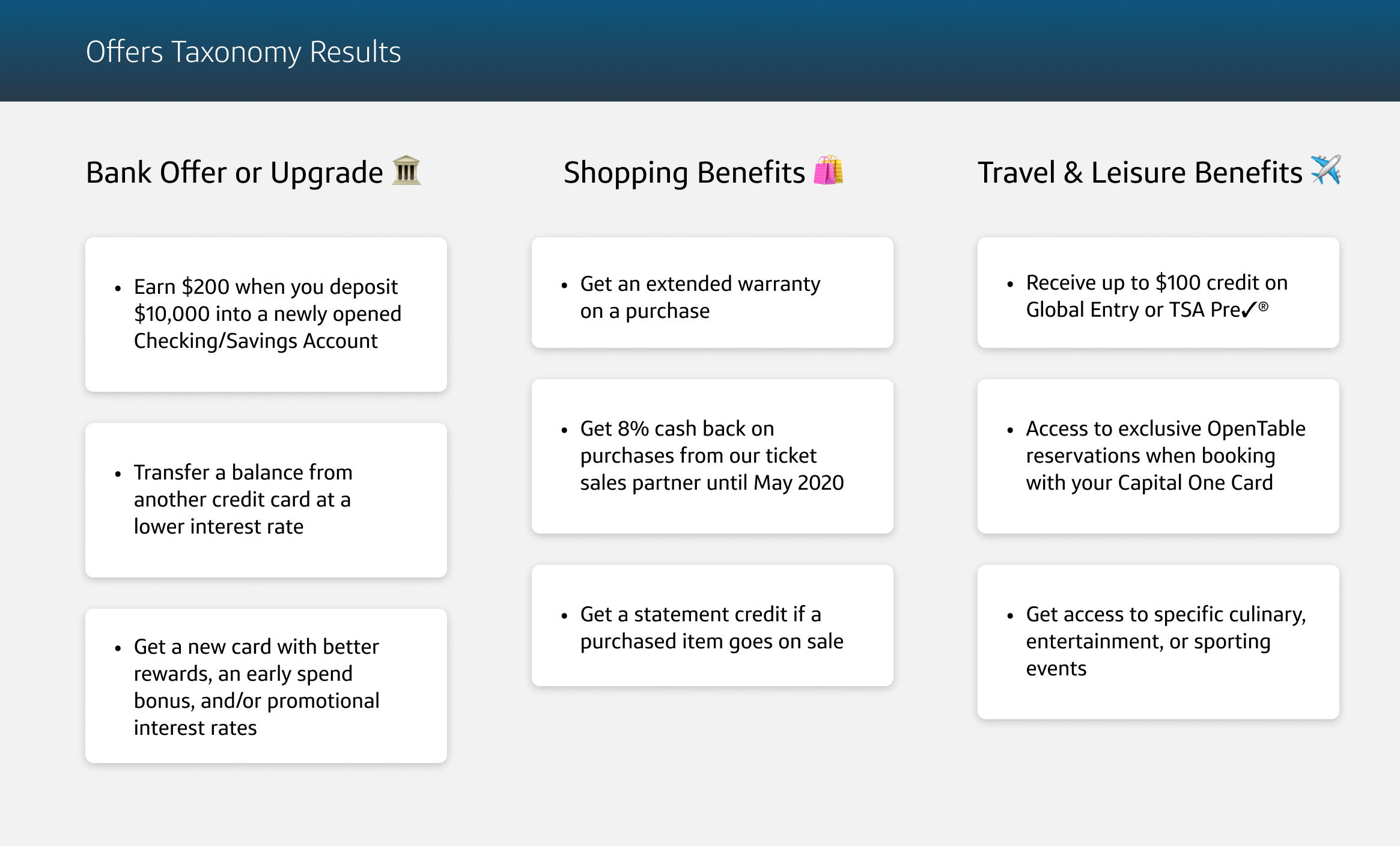
What is an Offer?
The first step in developing our Offers Center was to narrow down what our customers considered a Capital One Offer, as opposed to a reward or benefit - two other features that while are similar to an offer, differ in terms of content and terms. While internally our marketing and product teams had their own ideas of what constitutes a Capital One Offer, what truly matters is our customers’ conception. We conducted a closed card sort in order to determine exactly what credit card customers considered an offer vs. other types of card features.
RESEARCH
Competitive Analysis
Now that we identified exactly what would live on our Offers Center, we went to other companies who had similar offers, and gathered insights from how users navigated to, evaluated, compared, and redeemed these offers. These insights would help us discover what works and what doesn’t, and aid us in constructing our user experience.
Some of the most important insights I gathered were:
✅ These types of offers are usually highly elevated on the web experience compared to how our current Offers Center was tucked away behind several layers of menus
✅ Tiles are a popular way of organizing and presenting information on an offer, and this approach allows for many to offers to be displayed and digested at one time
❌ Banners and heroes are common for social media and other types of product offers, but these are often scrolled past.

DESIGN
User Flow and Lo-Fi Wireframes
Once we had properly defined the problem space through our initial research, I began constructing a user flow depicting the journey of a user finding and redeeming an offer. When constructing this box and wire flow I documented the user needs and feelings to keep us grounded in our designs.

From here, I flared and explored different organization and orientations to allow users to easily find and evaluate their different offers for both web and Native.

DESIGN
Entry Point
I then took our lo-fidelity wireframes, and utilized our design system and components to bring the designs to high fidelity. I did this for our web, iOS, and Android platforms. This was one of my first experiences designing for Native, so I learned a lot about iOS and Android design systems and language.

For our entry point, I wanted to focus on several principles that we identified through our initial research. Our entry point:
Has high visibility (located on the first screen when a user logs in)
Introduces the “offer card” design language which is consistent throughout the experience
Allows direct access to a promoted offer
Directs users to the Offers Center if the offer they are interested is not the one promoted
By including an offer card on the first screen a customer opens when they log in, our Offers Center is prominent and easy to navigate to. Depending on the customer, different offer cards can occupy this space, giving customers direct access to the offers that best suit their needs.
DESIGN
What’s in an Offers Card?

DESIGN
Offers Center Structure

The card layout of our Offers Center creates distinct visual divisions between the offers, allowing customers to easily scan through the page to find the offer they want. Only important and differentiating information is provided in the card. This was definitely an exercise and exploration in content design. This structure creates an experience that:
Allows users to easily view and compare their different offers
Visually distinguish offers of different kinds with the use of icons
RESEARCH
User Testing
Going into User Testing, me and the researcher on the team came up with several learning objectives that we wanted to focus on during the usability tests. These objectives were:
Understand if and how users will find the entry point, as well as expectations about where they would find it
Assess the extent to which users understand what they’re seeing, as well as the context and information they need to understand and evaluate an offer
Identify motivations to return to such a page, and understand the reason and timing for that, as well as expectations of updated content, details, and other offers.
Our user testing consisted of 30 unmoderated qualitative sessions followed by 5 moderated qualitative interview sessions. We created and tested a prototype of the user flow for our MVP, as well as several post MVP ideas that I had mocked up.


RESEARCH
Findings
The key findings from our research were very positive:
Only one out of the fifteen participants were not able to find the entry point on Web, while only four out of the fifteen participants were not able to find the entry point on Native
Almost all the users found the information on the page useful and what they expected
Many users stated they would come back and check the Offers Center once a month or even more frequently.
CLOSING
Post-Testing and Lessons Learned
While I rotated from the team shortly after the testing concluded, the positive user testing results spoke for themselves, and minimal design work had to be done to get the MVP ready for development. The changes we made were mostly to the native designs, by making the entry point mirror the web design more. The final designs and clickable prototype can be seen below. The Capital Offers Center has officially launched for cardholders on Web, iOS, and Android as of June 24th. While it is currently active for only 10% of customers, we expect to scale to all C1 customers in Q3 2021!
Throughout this project, I learned the importance of initial generative research. Without the guidance for determining what our pain points were and what our users wanted, our Offers Center would not have the strong guidance we needed when designing our screens. By being able to layout exactly what the user wants and expects, we had backing and justification for our design decisions when working with product and tech partners, and our customer-first approach paid dividends in our results.