Platform to Platform Data Management
Role: Primary UX/UI Designer
Length: August 2020 - March 2021
Tools: Figma
📔 Project Overview
As Capital One begins to modernize their internal finance applications for associates, it’s important to evaluate where we can streamline and combine experiences for more efficiency. I was the lead designer on a team dedicated to modernizing our reference data experience, and expanding its capabilities to support a wider range of users. Due to changing data privacy requirements, we had to eventually migrate our experience over to another platform, creating the first ever cross-platform data experience at Capital One.
✏️ Responsibilities
Wireframing, designing, and prototyping an internal reference data table spreadsheet experience
Constructing user journey flows and generative research to direct design strategy decisions in meetings with stakeholders from a variety of teams
Championing design and Finance Platform user needs in meetings with both product and designers from other internal data teams

Problem Space
⚡️The Challenge: How do we help users register, publish, and manage reference data across platforms?
Reference Data (otherwise known as Look-Up tables), are generally static data tables that finance associates append or join to other datasets. Both the Finance Platform and Enterprise Reference Data Management (ERDM) had users who were uploading and managing their reference data on two separate experiences. With ERDM shutting down, we wanted to evaluate how similar the ERDM and Finance Platform reference data journeys were to potentially combine them. Additionally, we needed modernize the Finance Platform’s 1.0 experience, as the UI elements were very outdated. The existing experience had issues with:
Clarity of table elements, conflicting call to actions
Wasted real estate removes focus from the table
Placement of UI elements creates confusion for users

The current state of reference data on the Finance Platform
Project Process

INITIAL RESEARCH
User Journey Maps
We conducted generative research interviews with both Finance Platform and ERDM users to determine whether or not we could migrate the ERDM users over to the Finance Platform user experience. From the findings of these interviews, I created two user journey maps in order to evaluate the state of each experience and see how similar they were.


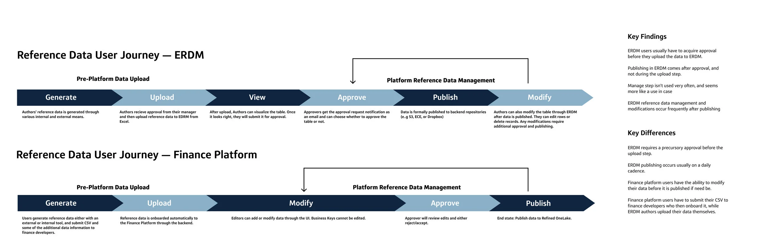
When looking at the experiences side-by-side, it is evident that both user groups interact with reference data in similar ways. After some discussions with product and tech teams on both platforms, we decided that migrating the ERDM users over to the Finance Platform was not only doable, but the best way to move forward from a user experience POV.
DESIGN
User Flows
Once we had decided ERDM users would move to the Finance Platform, I began creating box and wire flows for our current state and future state. We showed these flows to our product partners so we could align on what features we wanted to bring to our MVP. These box and wire flows are also super helpful in mapping interactions and giving me a head start in actually designing screens.
What I was focusing on initially was this “Modify” step, where users are viewing and manipulating their reference data tables. This was the area of most of our current users’ pain points.

I also created this flow, which incorporated slightly more visuals to the experience. Providing these to our product and tech partners really helped them start visualizing what our end-to-end user experience would look like.

INITIAL RESEARCH
Competitive Analysis
I began by looking at other table experiences, from AirTable to Google Sheets to gather inspiration and see what other companies were doing right in regards to filtering and sorting their tables.
Some of the most important insights I gathered were:
✅ Interacting directly with the columns was a common way to filter and sort
✅ Having easy ways to clear or reset the table was useful
❌ Many experiences opted to leave the search box under each column out

DESIGN
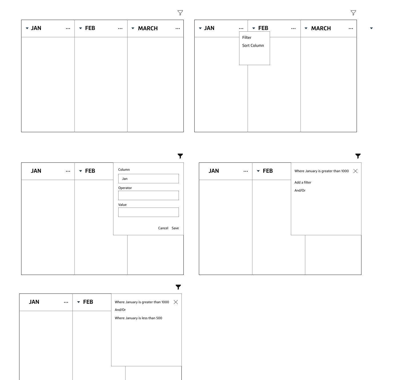
Wireframes and Sketches
I created wireframes for different filter and sort scenarios, both outside of the table as well as nested within the columns. I also sketched out some solutions for editing a record (or row). I find it really important to flare out during your initial design wireframes to make sure you aren’t overlooking a solution!


DESIGN
High Fidelity Table Design
After the sketches, I began pulling in our design system components to build out higher fidelity table designs. Building out the table was definitely an interesting Figma exercise for me! Organizing the row layers and figuring out how I wanted to structure the table was almost a whole design challenge in itself 😅. This design had several principles behind it:
Allowing users to filter per column, keeping a lot of the same functionalities that Excel and Google Sheets have
Creating an easy to use editing system, clearly showing what cannot be changed on each row
Highlighting actions that a user needs to take to complete the task they are here for (submitting, adding, or rejecting records).
CHALLENGE
Curveball! ⚾️
While I was working on the table designs, new data requirements caused our project to pivot. We were now required to onboard our reference data through another data platform at Capital One, called the Exchange. Suddenly, I had to onboard a whole team of Exchange designers to the reference data work, as well as begin to modify the table experience I created to fit their design systems and language. I also had to learn about data standards and onboarding at Capital One, and the different requirements the Exchange has.
I represented the Finance Platform, working with a team of three designers from the Exchange. We had to almost start back at square one, creating basic user flows to outline the different screens we needed to create.

DESIGN
High Fidelity Reference Data Flow
Luckily, many of the Exchange onboarding screens had already been created, since the onboarding experience for other types of data was already live. We began dropping in screens where we could, and I took initiative to create some of the screens that we were missing such as file upload and the connection points between the Finance Platform and the Exchange

A very high-level look at our flow - it’s pretty massive!
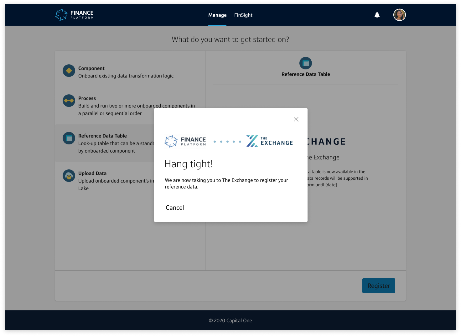
Finance Platform -> Exchange Connection Point
When connecting users from one platform to another, it is important to make sure the transition is not jarring or confusing. It was also important to let the users know that the Finance Platform would not be supporting reference data onboarding at a certain date. I wanted to create an entry point that was
Seamless, making sure the user knows where they are and where we are taking them
Informational, letting users know the important platform-wide changes that were happening to reference data


Uploading your Data Table
After you fill out some metadata for your reference data, you can upload your data table. I created a simple single file upload for the Exchange, since their data upload pattern allowed users to upload multiple files. You are only allowed to onboard a single reference data table at a time, so I wanted to ensure that that language was clear to the user.


Table Experience
Once you have uploaded your data table and defined your schema, you can view and modify your table before submitting it for approval. I skinned the table to fit the UI of the registration process, and allowed users to expand the table to see more information about their records.

Prototyping the Table
Prototyping this table was an absolute beast. There were so many functionalities I had to bake in to get the table ready for user testing. I definitely leveled up my Figma prototyping skills putting this together! Learning how to use overlays was super fun. You can see a quick video of how the prototype worked below.

Holy connections Batman! 😰😰😰
RESEARCH
PURE Method and Usability Testing
We first conducted a PURE Method to catch any general usability issues before gathering real users for a user test.

Most of the issues had to deal with the Finance Platform entry point, but this was a pretty good usability score for such a complex and lengthy experience. We made some adjustments based on the feedback, and we took our prototype into user testing with nine actual reference data users, some from the Finance Platform, and some who used the old EDRM tool.
Overall, most users liked the designs and felt that while it would be a transition from how things are done today, it was a pretty intuitive experience.

Recommendations
While the entire experience was viewed favorably, and there were no major usability issues with the process, users had some suggestions around the functionality of the table. The largest of these being
Using a different icon for expanding the table
Having a “freeze pane” option instead of pinning columns like Excel
Allowing inline editing of the table instead of the drawer format
Post-Testing and Reflection
We presented our work and findings to several groups of stakeholders across the Data design world at Capital One. Since this was the first cross-platform data experience, many teams were interested in how we collaborated and the designs we built. Sadly however, due to product swirl this work has been de-prioritized and I was moved off of the project.
Throughout this project, I demonstrated my flexibility and teamwork, having to constantly shift goalposts due to product needs, and onboard designers who weren’t familiar with the work I was doing was a challenge, but one that I completed successfully. It was fun working with designers from other platforms, and I learned a lot about data privacy at Capital One. I challenged myself with creating some of the most complex user flows and prototypes that I have made since joining the team, and it definitely showed me the importance of visual storytelling when communicating with tech and product partners. Thanks so much to Dustin, Shasta, and Emily for being an amazing team to work with ☺️